Frontend learning project
Omnifood
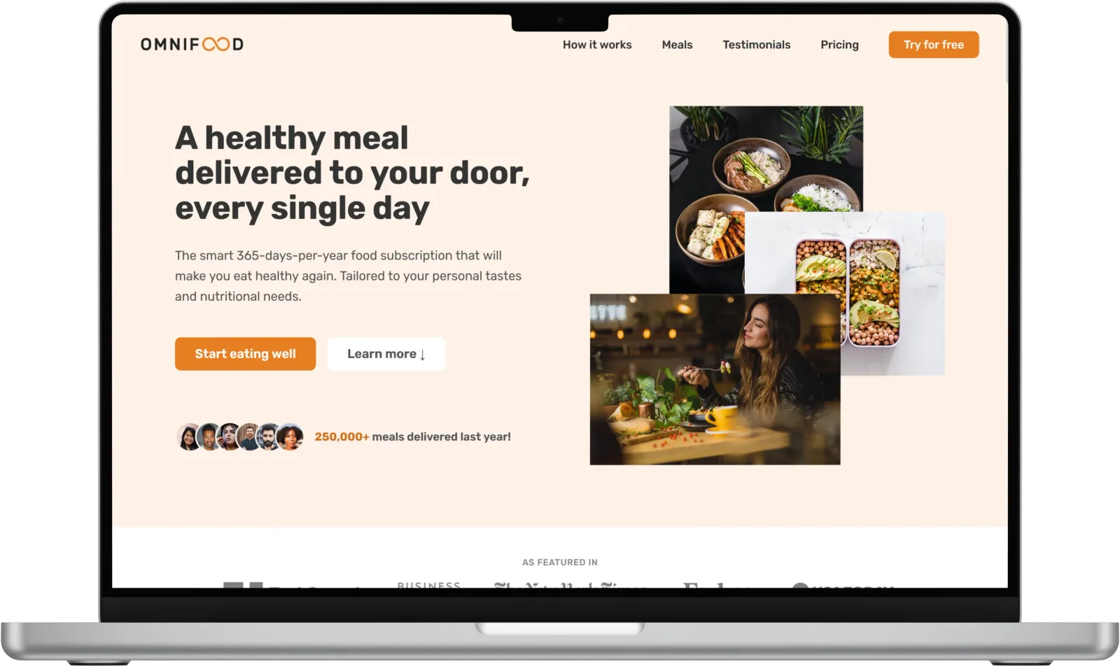
A responsive landing page for a fictional food subscription service. A study in visual hierarchy, page rhythm and adapting content to different screens.
- Role
- Frontend implementation
- Stack
- HTML · CSS · JavaScript
- Context
- Course-based project
- Year
- 2024
The brief
Give a visitor a clear route from understanding the service to exploring meals, plans and the sign-up form. Photography and section hierarchy need to work together across a long page.
Built through Jonas Schmedtmann’s HTML and CSS course. Omnifood is a fictional brand, not a client commission.
Design decisions
An order for the information
The introduction establishes the service before the page moves into meal examples, social proof and pricing. Each section answers a different question rather than repeating the same sales message.
Layouts that rearrange
Columns, images, navigation and the form adapt to the available width. The device views make these layout changes visible without requiring the visitor to resize their own browser.
What I learned
A responsive page depends on more than smaller type. Image proportions, line lengths, navigation and the order of information all affect whether the page remains clear.
Where I would take it next
Revisit the original implementation with keyboard and assistive-technology testing, tighter asset delivery and real content. Any claims about usability or conversion would need evidence from actual users.