Interface experiment
Animated sign-in interface
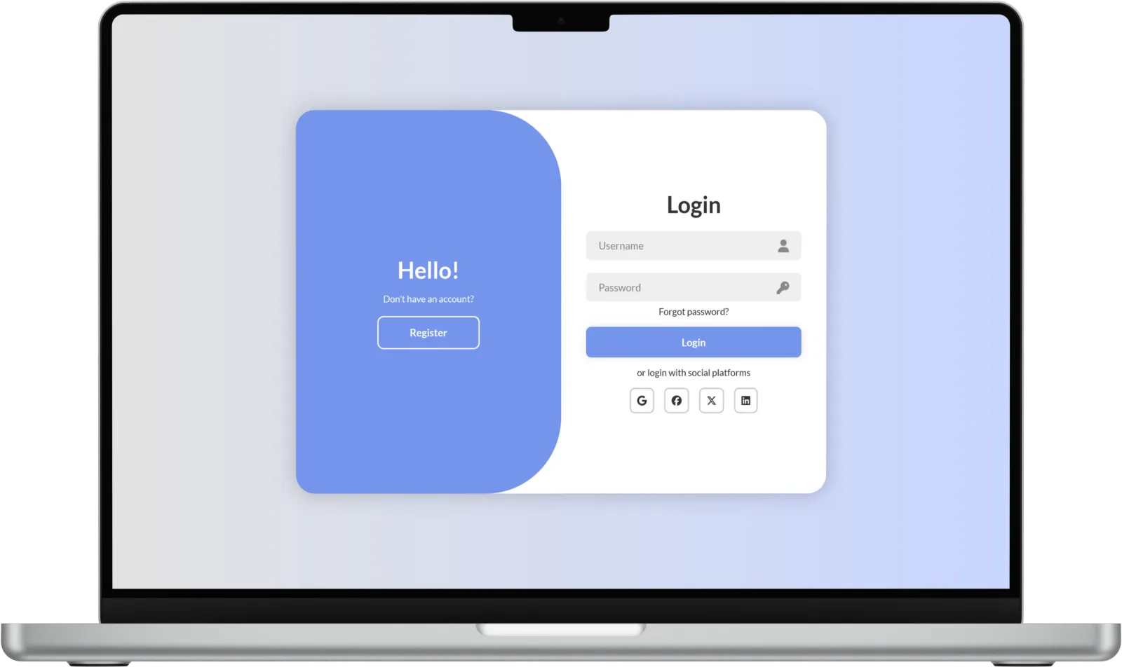
Two forms, one shared composition. An exploration of how layout and coordinated motion can connect sign-in and registration.
- Role
- Frontend implementation
- Stack
- HTML · CSS · JavaScript
- Focus
- Forms & interaction states
- Status
- Visual prototype
The brief
Make switching between sign-in and registration feel like a change of state within one interface. Keep the form hierarchy clear while the surrounding panel changes position.
A frontend learning prototype. The public demo shows interface behavior; it does not provide a working authentication service.
Design decisions
One state, coordinated motion
A class on the main container controls the visual state. CSS positions the forms and colored panel, while JavaScript switches that state in response to the controls.
Keep the task recognizable
Fields, the main action and the option to switch forms retain a clear grouping. The saved device views show how the composition was arranged for different screen sizes.
What I learned
Small interfaces make timing and hierarchy very noticeable. Several moving elements need a common state, and motion must never make the form harder to understand or use.
Before real authentication
A production version needs secure server-side authentication, proper field labels and errors, password-manager support, keyboard testing and a reduced-motion option. Those are separate from the visual prototype.