Omnifood — responsive marketing landing for an AI-powered food service.
A fully responsive, component-driven marketing site for a fictional startup that uses AI to plan weekly meal subscriptions. My exercise in fluid grid layouts, typographic rhythm, and accessible forms — everything hand-written, no frameworks.
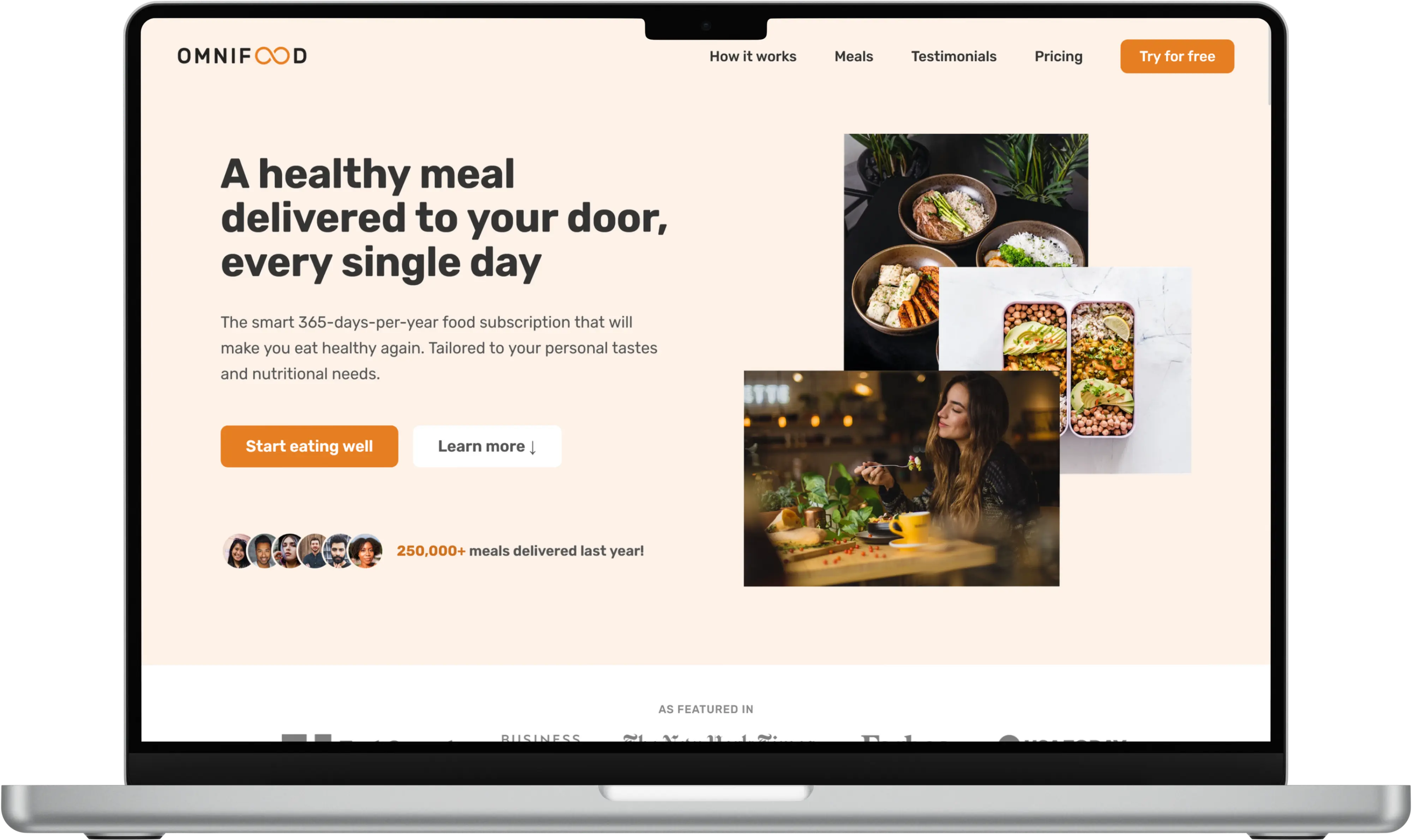
The brief
Build a full marketing site for a fictional AI-powered food delivery service — one that ships as an actual responsive, production-grade landing page, not a Dribbble mockup. The site needed to cover: a strong hero, a how-it-works section, a featured-meals gallery, testimonials, pricing, and a signup form.
The constraint: no frameworks, no UI libraries. Semantic HTML, modern CSS (Grid, Flexbox, custom properties, fluid type), and just enough JavaScript to handle interactive pieces.
Design decisions
Fluid typography
All headings use clamp() with viewport-relative units to scale smoothly from 320px phones to wide desktops, without jarring breakpoint jumps. The body type stays at a fixed 16px / 1.6 for readability.
Grid-first layout
Every major section is a CSS Grid with explicit column definitions at desktop and a single-column fallback below the 800px threshold. Flexbox handles only small component-level alignment.
Accessible forms
The signup form uses labelled <input> elements, client-side validation that announces errors via aria-live, and visible focus states that never disappear. Forms are the thing most landing pages get wrong — I wanted to get them right.
What I learned
- How much vertical rhythm matters — setting a consistent spacing scale changed the whole feel of the page.
- That fluid type eliminates a whole class of responsive bugs you'd otherwise spend hours on.
- Semantic HTML plus good focus styles plus proper labels = accessibility for free. Retrofitting it later is brutal.
The production-grade details — hover states, focus rings, skip links — are what separate a design from a site. They're also invisible until they're missing.