This portfolio — a multi-page single-CSS-file site.
The site you're currently reading. Built as an exercise in restraint — one shared stylesheet, one shared script, zero frameworks, and the typographic system that holds everything together.
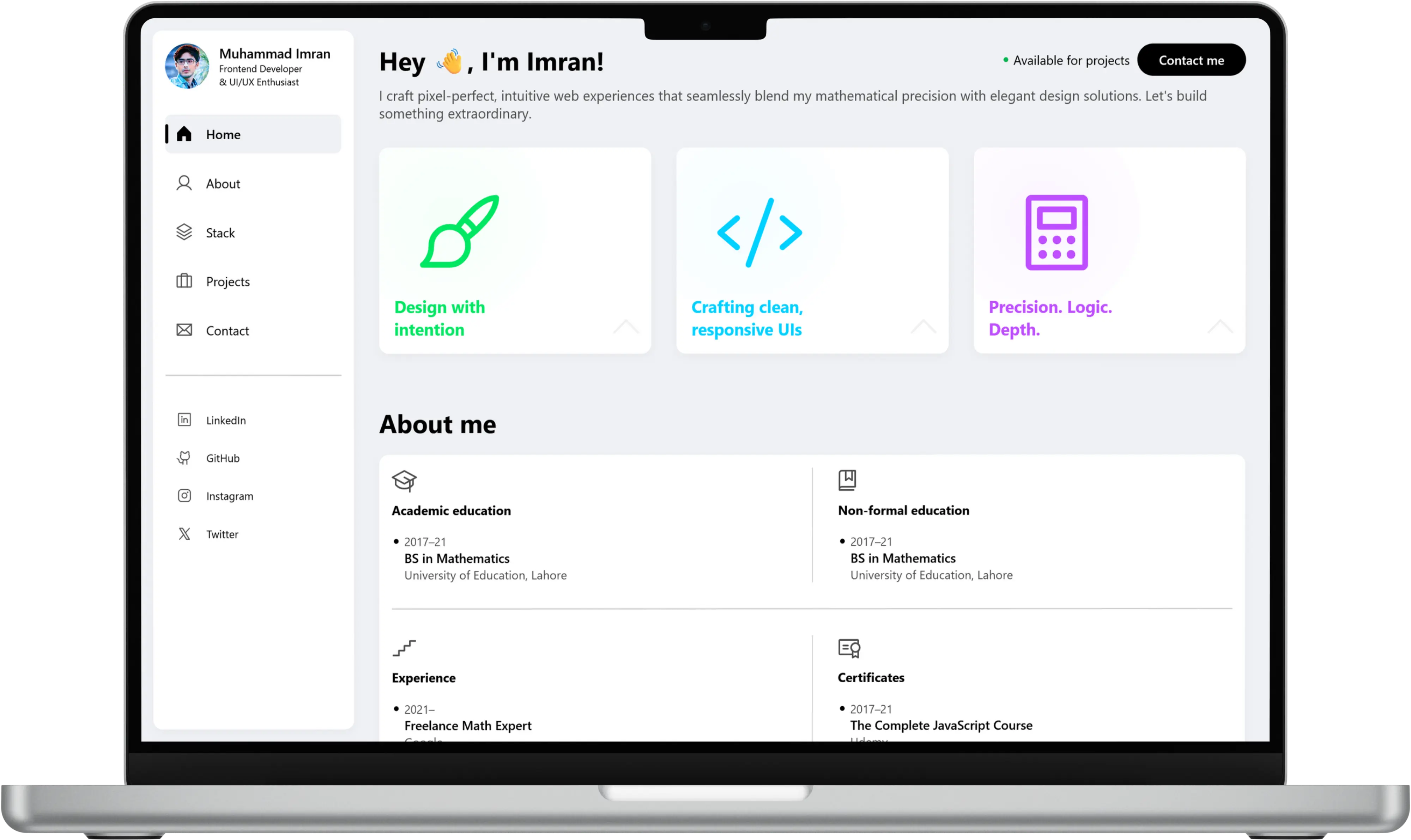
The brief (to myself)
Build a portfolio that honestly reflects three parallel roles — AI research contributor, frontend developer, tutor — without mixing them into a single pile. Each role needs its own accent colour, its own section, its own hierarchy, but all three need to feel like parts of the same person.
No frameworks. No component libraries. No AI-slop design tropes (Inter on glassmorphism, purple-blue gradients, hero-with-stats-strip, etc.). Editorial type, warm paper, ink contrast.
The architecture
One shared stylesheet, one shared script
All pages — the homepage, four project pages, solutions hub, tutoring detail, math chapter — load the same styles.css and scripts.js. Every component I build on one page is automatically available to the others.
Three accent colours, one per pillar
Research gets a deep ink-navy. Frontend gets a forest sage. Tutoring gets an amber gold. Each section's data-pillar attribute switches a --pillar CSS custom property, which cascades to every child — borders, buttons, tags, focus rings.
Mobile menu as a separate element
An earlier version of this site had the mobile menu nested inside the sticky nav. That created a subtle stacking-context bug where the overlay didn't fully cover on some devices. In this version the mobile menu is a top-level element with its own position: fixed and z-index — bulletproof.
Timeline without the chain
An earlier version used a vertical-line-with-rings design for the About timeline. It looked fine, but it didn't mean anything — the rings weren't really connected to each other. The current design drops the chain entirely and uses clean sectional groups with strong typographic hierarchy.
What I wanted it to feel like
- Aesthetic without being precious — it's a CV, not a coffee-table book.
- Accurate — every link resolves, every page loads, nothing is a placeholder.
- Clean — warm paper, deep ink, generous spacing, serif display type.
- Pixel-perfect on mobile and desktop, with motion that respects
prefers-reduced-motion.
A portfolio is a credibility artefact. It has to be the best thing on the page, because it's the only argument the reader has to trust you with the next one.