Modern animated login & signup — a study in state, motion, and trust.
An authentication flow that moves. Layered transitions between login, signup, and password-reset states, with micro-interactions on every field — the small stuff that changes whether an app feels cheap or trustworthy.
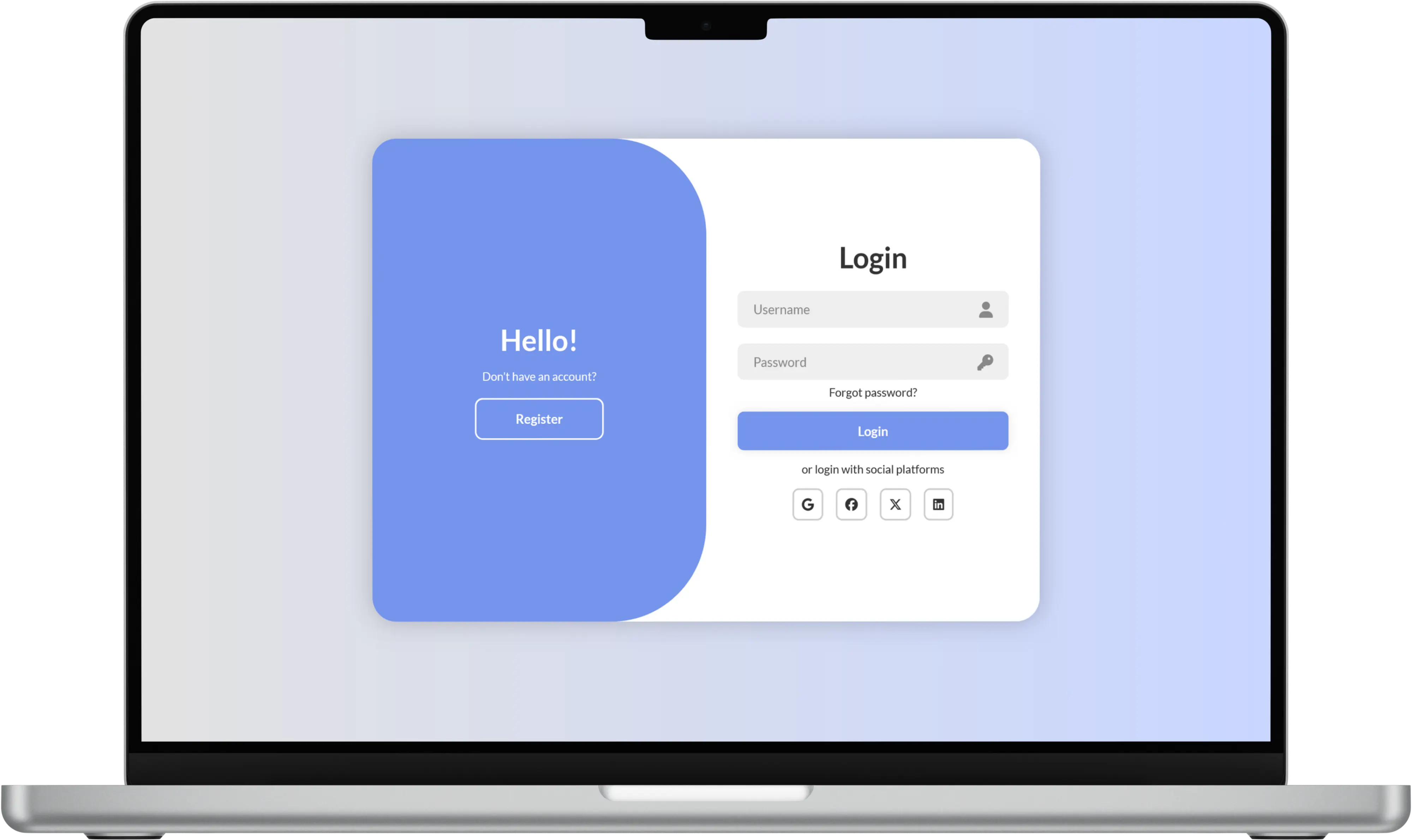
Why bother animating login?
Authentication screens are usually the first impression an app makes on a returning user. Most of them are flat, abrupt, and untrusting — inputs snap in, errors pop up like alarms, and switching to "sign up" means a full page reload. I wanted to prototype a version where every state change feels continuous.
Design decisions
State as animation
Switching between login and signup doesn't swap the form — it reveals new fields underneath and gently pushes the button down. The same form grows and shrinks as you move between modes.
Field-level feedback
Inputs validate as you type, with smooth colour transitions on the border and a short message that slides in from below. Errors never block the layout; they're non-destructive.
Button-as-progress
The submit button doesn't disappear during submission — it morphs. The text slides out, a loader slides in, and on success the whole button briefly becomes a checkmark before redirecting.
Technical approach
- All transitions built with pure CSS
transformandopacity— no JS animation libraries. - Form state (
login | signup | reset | submitting | success) managed via a single data-attribute on the form root, which drives every child's styling. - Motion respects
prefers-reduced-motion— all transitions collapse to instantaneous when the OS requests it.
Motion is not decoration. Done well, it tells you what just happened and what's about to happen — before you have to read any text.